
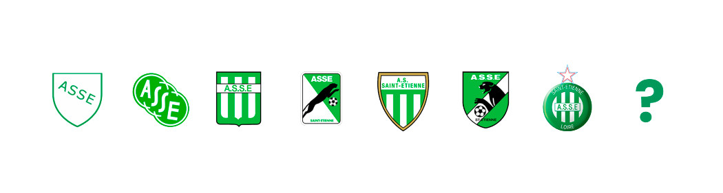
After working in collaboration with its supporters, AS Saint-Étienne is preparing to change its visual identity and thus its logo. A few hours before the revelation, spotlight on the last 3 logos of the club.
1980-1987 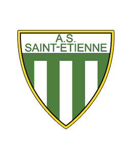
If the panther disappeared from the logo in 1980, it remains an inseparable emblem of the club. The patch returns to its original shape and the vertical green and white stripes of the third logo are also back. This is the first time that the label “A.S Saint-Étienne” has been used. The gold rim refers to the record of the club won since 1957.
1987-1992 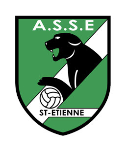
In 1987, the panther made a brief reappearance, but it was used much less and less appreciated by supporters. The concept of this logo is the same as that of 1968 with the so-called roaring animal. It is accompanied by a double denomination “ASSE” and “St-Étienne” and the presence of a ball … which, between us, moreover looks more like a volleyball ball. This logo will have a very short lifespan.
1992-2022 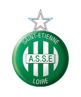
This is the current logo of AS Saint-Étienne. Created in 1992, it went through a few small adjustments at the start of its use. In 1992, there was no Blue-White-Red star above the logo, it was added a year later, in 1993, symbolizing the 10 French championship titles. The vertical green and white bands are still used and three names appear on the logo “Saint-Étienne”, “A.S.S.E” and “Loire”. In the early 2000s, the logo was slightly modified with an emphasis, giving the badge a 3D effect. This logo remains the oldest for a Ligue 1 club Uber Eats today, and will remain so until June 30, 2022.
> Green the Future