
![]()
Last weekend, AS Saint-Etienne presented its new logo which will be used from the 2022-2023 season.
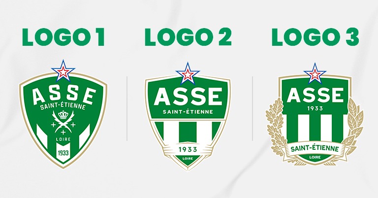
In a Fan Engagement initiative launched in September, nearly 16,000 ASSE supporters were able to vote and choose the logo from among 3 proposals unveiled a few weeks ago. “ASSE thanks all of its supporters for the strong mobilization they have shown. This authentic and participatory approach allowed the election of a logo by majority, counting 61% of the votes for proposal 1. Logo 2 received 16% of the votes and 3 counted 23% “ specifies the club.
Last September, AS Saint-Etienne announced the launch of a collaborative approach to build its new logo. The club and the BARONY//TRENTA agencies then organized working groups with 42 people from different backgrounds (representatives of supporter groups, partners, ambassadors, supporters, players and employees).
The storytelling of ASSE’s new logo – “VERT L’AVENIR”
An alliance of digital inspiration and marked Saint-Etienne origins, the chosen logo, with its unique typography, sports a form of dynamic coat of arms, resolutely futuristic without denying the past.
This new logo has the main specificity of integrating several elements of the coat of arms of the city of Saint-Étienne into its coat of arms: the two palmes d’or, the crown and the three crosses.
The Blue-White-Red star, symbolizing ASSE’s 10 French championship titles, still reigns at the top of the logo but is now integrated into it and has more pronounced borders.
For the first time in its history and just before its 90th anniversary, the club will also see its year of creation, 1933, inscribed at the bottom of its emblem, in one of the three white stripes.
These green and white bands, which first appeared on the club’s logo in 1960, are a reference to the exterior blinds of the Casino brand, whose founder, Geoffroy Guichard, also created ASSE in 1933.
The golden outline, already present on several old logos and highlighting the history and prestige of the club, also marks its return. Gold will thus integrate the palette of secondary colors.
Finally, the character size of the various denominations present on the logo now promotes better hierarchy and readability.
A version of this logo enriched by a representation of oak and laurel branches, symbols of strength and eternity, will mainly have institutional uses.
Through this new emblem, ASSE carries values dear to the city of Saint-Étienne: respect for heritage, combativeness and innovation.