A highly sensitive subject, many French professional clubs have nevertheless embarked on projects to overhaul their coat of arms in recent months. To avoid making mistakes that are too big in the eyes of their fans, many of them have adopted a collaborative and participatory methodology in the design of their new logo. Does this mode of operation satisfy the marketing and economic objectives inherent in such a project? Lighting.

“We wanted to set up a collaborative project by making our supporters real actors in the design of our new logo. The tone is set by Thomas Granger, Communications Manager of AS Saint-Etienne. Considering for several years to modernize its logo, among other things for homothetic reasons, the management of ASSE set in motion at the end of last season a project to redesign its emblem, by adopting a methodology allowing to associate its supporters throughout the process.
Questionnaire sent to the different communities to identify the strong symbols attached to the club, constitution of a panel of 42 people bringing together representatives of groups of supporters, former players and employees of ASSE to guide the selected agency – Barony and Trenta – in its artistic work, final ballot open to supporters to designate the new logo from three versions selected… never had a French professional club gone so far in consulting its supporters concerning a logo project. Despite the sporting crisis that ASSE is currently going through, the club has received the support of its fans at each stage of its creation. In particular, the club collected more than 12,000 responses to the questionnaire launched upstream of the project and more than 16,000 fans took part in the final vote to designate the new emblem, unveiled on 1er last January and definitively adopted on 1er next July.
“We wanted to set up a collaborative project by making our supporters real actors designing our new logo”
Thomas Granger – Communication Manager – AS Saint-Etienne
By maintaining this collaborative approach throughout the process, the Saint-Etienne club has thus managed to combine the expertise of a consulting agency while taking into account the analyzes and opinions expressed by its supporters. A mode of operation that has enabled the club to modernize its emblem while retaining the strong elements attached to its identity, including in particular the blue-white-red star which still sits proudly above the coat of arms. New elements, resulting from exchanges between the members of the panel of 42, have also appeared, such as the date of creation of the club or even certain symbols linked to the coat of arms of the city of Saint-Etienne.
The 3 finalist logos – ASSE
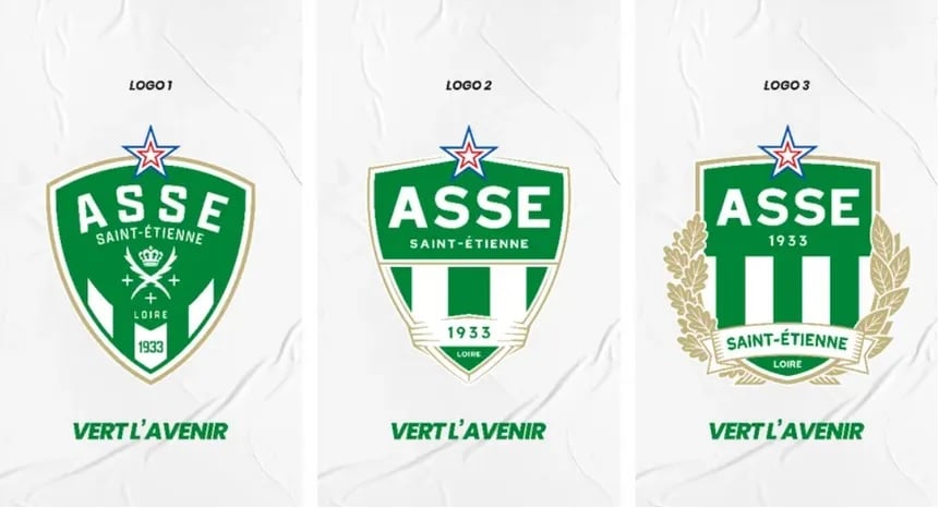
“The design of the finalist logos was greatly enriched by the responses to the initial questionnaire, the artistic creation work of the Barony et Trenta agency and the reflections carried out by the panel of 42. It is moreover the members of the panel who have decided on the three finalist creations. During the project, the panel met four times: 3 times in person and once by videoconference. These discussions were crucial to bringing the project to fruition,” said Thomas Granger.
Have participative and collaborative mechanics become indispensable?
A logo redesign project is never an easy topic to tackle in the professional sports industry. Very attached to the emblem of their club, the most fervent supporters can express strong reactions if the new creation does not correspond to their expectations. FC Girondins de Bordeaux made the bitter experience of this by adopting a logo during the 2020-21 season which angered supporters, in particular because of an inversion of the club’s name in the emblem. One of the first decisions of Gérard Lopez, who took over the club in July 2021, was to… return to the old logo. Choice that will be definitively recorded next season, with a jersey that will feature the club’s historic logo on the scapular.
“Typically, a logo redesign is part of a broader work of defining a club’s branding strategy. In a rebranding project, the logo design represents only 20-30% of the creative work but it takes 99% of the attention! The other key points related to the platform and the architecture of the brand, to the specific versions or even to the expression of the brand territory are of less interest to the fans,” explains Dominique Jubert, Managing Director of Leroy Tremblot, branding agency. at the origin of the new visual identity of FC Nantes or the Stade de Reims within French professional football.
Why is the logo so exciting to professional club communities?